As many of you know, for Christmas my daughter Emily wanted to give her room a makeover. This all started when she graduated from a twin bed to a double bed which happened within a few days of a visit to the new Ikea store in Charlotte, NC sometime this past summer.
Emily is 15 and is a big fan of Pottery Barn Teen. She had seen black, white and purple bedding in a catalog that came in the mail and fell in love with it. She loves purple. She loves black and white graphic images and she loves the "teen" look of this bedding. I, however, had a different idea in mind. As with any interior design job you have to meet the client's needs and I had two "clients". The first was Emily with her style and desire for a very cool room. The second client was my husband, Scott, the one paying for this makeover. He, of course, wanted to keep me on a tight leash knowing my tendancy to want high end items. This makeover was a challenge in more ways than one!
Scott and I had agreed that we didn't want to replace the flooring upstairs with more carpet. He and I both prefer fiber free options. We decided on laminate. It is a scratch resistant surface that should hold up beautifully to teens and pets. The room needed a new paint job. We asked Emily to pick a purple that she would like to use. We then chose a lighter shade of that color for the walls knowing we could bring the darker shade in with accents.
Emily had seen a desk at Ikea that was black glass with a clear floral pattern stenciled in. We used that desk as the inspiriation piece for the rest of the room. While I was at Ikea, I saw a black and white fabric that looked like it was designed by the same person that created the pattern on the desk. This became the canopy and bedskirt.
I had seen wooden wall cut-outs in an online design project and I knew that I wanted to incorporate that into the room. I drew branches loosely based on the pattern in the fabric and my dad cut them out with his jigsaw. God bless him. We then painted them the dark purple Emily had chosen. We added rope light to the branches so that they would cast a soft, moody glow on the walls. What is not shown in the pictures is a canvas of the Eifel Tower that hangs on a dark purple cut-out that highlights the art. My mom, bless her heart, sewed the bedskirt, canopy and all the pillows on the bed.
Emily didn't want any of her old furniture in her new room. As a matter of fact, she didn't want anything but a desk and a bed because she wanted her room to feel spacious. I knew she would need a night stand, so we repurposed a cube that had served elsewhere in the house for storage. We added a base and the small size, 22 inches, makes the perfect compact night stand, just enough for a new lucite lamp, a book and a place to put a glass of water at night.
Some art by a local artist and a bookshelf above the desk to house Emily's favorite books finish out the desk area. The windows were treated with a stripe on stripe sheer in white that softens the window and breaks up the light purple wall.
My two "clients" loved the result. My daughter is thrilled and already has invited friends over to "sleepover" in her new room. My husband was happy because I achieved what Emily wanted at a price he had specified.
A friend of my commented that the room was very clutter free and that Emily would likely add her own touches. It was as if she read my mind! I purposefully did not add picutres, desk accessories and decorative items because I knew that Emily would want to put her own mark on the room and that is just what I want her to do, only then will it be perfect!
Subscribe to:
Post Comments (Atom)
Calgon Take Me Away...

soak your troubles away in this stone beauty

Bathtub becomes fountain... fabulous!

cottage charm!

perfect for your mountain retreat!

Where I belong...
The AIDP Charlotte Chapter Board Members

Seated from left, Davetta Moore, National Board Member, Wanda Horton, Vice President of Communication, Jane Ann Maxwell, President, standing from left to right, Nancy Martin, Vice President of Membership, Mary Santini, Secretary/Treasurer, and Marianne Parker, National Board Member
Emily's New Room


This desk was the inspiration for the room
Decorating for Christmas in Adult and Kid Zones...

Adults will love the beauty of the luxe mantle

This bright, bold mantle is kid friendly

This lovely arrangement is sophisicated and elegant

Kids tables need centerpieces too and these serve as favors to take home afterwards!
The Holiday Table...
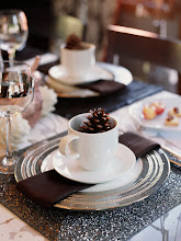
This table setting would make a beautiful Thanksgiving breakfast table

Greenery - simple and elegant
These pictures illustrate the idea of using what you love...
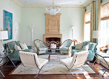
One home owner loves classic traditional decore, the other mid century modern. Look at what they created using the things they both loved!!!

Grouping beloved collections create impact

Two collections united by color
Pictures from the Coastal Vibe Project
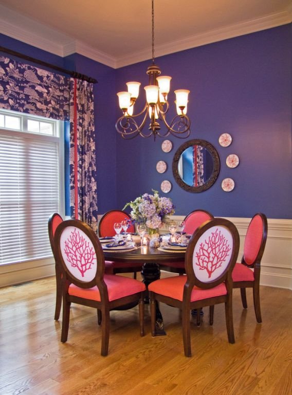
The chair fabric was designed just for this client and then made into yardage just for these chairs!

The living room seating area. The client wanted it elegant and yet relaxed, with the idea of being at a house on the beach.

We added the built-ins and had the paint changed before the homeowner moved in. A cozy seating arrangement and momentos from world travels warm the space.

another view
These pictures illustrate "staging" principles

This beautiful room was designed to be cozy and full. This room is an example of NOT staging to maximize the square footage. Thanks to House Beautiful for the image

This serene room is designed for maximum spaciousness! Notice that you see lots of floor through the legs of the coffee table. Lots of breathing room in this space. Thanks to House Beautiful for the image.
This is an example of Benjamin Moore Aura paints to go with the About Paint post

One of the many beautiful colors in the Aura collection

Aura paints have low VOC's which means it's healthier for everybody!
To illustrate the post "Art For Your Walls"
The following pictures are artwork from some of my favorite local artists. The fabulous thing about these folks is that they will do commissioned pieces especially for you! Enjoy...
Local Artists...

Richard Anderson

Celia Flock

Sany Seipert, an older work, her newer stuff is better, this was the only image I had...
The following pictures are from the October High Point Furniture Market.
These are some of the showrooms and displays that I thought were terrific.
Bella Luna was one of my favorite showrooms!
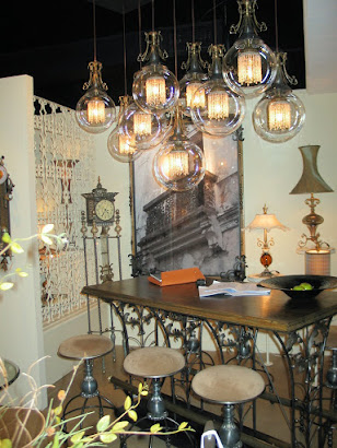
everything on display was quirky and elegant

One of my favorite finds, this mirror is a piece of art!

These sassy stools help tell the Bella Luna story

Cyan design always has unusual and neat things
Hot Color Trend shown at the Spring Market in Highpoint!
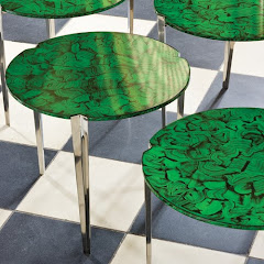
black and white and malachite!
Luxury Lighting!


Favorite New Accessoires...

Contact us for more information or to place an order...

love this!

simply elegant!

fabulous silver platters that are even better in person

These make such a great centerpiece for a dining room table
FALL MARKET 2008 - GORGEOUS COLOR, FOCUS ON "GREEN" DESIGN, FUN WITH LAQUER...
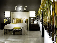
New color combo that was everywhere, butter and pewter, so pretty, soft and fresh!
Gorgeous Global Views - always my favorite venue
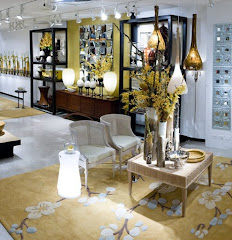
soft butter and pewter
"GREEN" in both color and sustainablity is a beautiful choice...

These pillows made from abaca leaves and coconut beads are eco-friendly and good for the workers of the developing country in which they are made.
Old favorites are still in play...

aqua, teal, peacock are still popular-- note the laquered mirror!
Before and After pictures are always fun!
This is a "before" picture of a recent project.
After #2!

Before #2
same room, different view
AFTER!
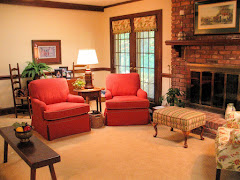
new carpet, upholstery, paint, window treatments...
More from the High Point Spring Market My Favorite Overall Venue - Global Views
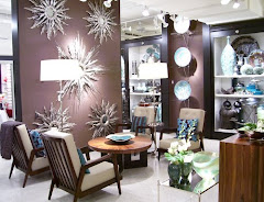
terrific accessories, uniquely displayed

black, white, red, silver punch!

note the male figures at the bottom of the ropes climbing out of the vases!
Favorite Find at the High Point Spring Market
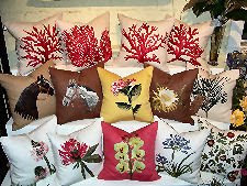
Pablo Mekis Artisan Pillows
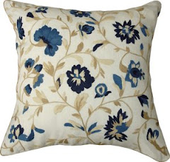
the hand stiching is fabulous!

more Pablo Mekis
A designer is as good as her team...
Every designer relies on a team of people to help execute her design vision. I have worked very hard to assemble a top notch team of craftsmen and professionals to rely on for excellence in execution and customer service. I have nick named them "The "A" Team". This name is so appropriate because this group brings their best effort to each task. There are many folks out there that will give you adequate, we strive for exceptional.
The following pictures will introduce you to some of the work done by these guys...
The following pictures will introduce you to some of the work done by these guys...
Introducing...
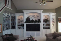
Heavin Woodworks - beautiful trims and built-ins
Introducing...
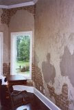
G.Richard Anderson Faux Finisher. He does fabulous work!
Oeco Textiles

all natural and all green
A staged breakfast room

We recovered the chairs to co-ordinate with the area rug and added a fresh bunch of flower from the grocery store!
This week...
This week, I am working on two interiors that are either on or are near Lake Wylie, SC. Both homeowners are interested in incorporating a coastal "vibe" into the design for their homes. Working on two homes with the same design direction has never happened in my business before. It will be fun to see just how differently we approach each home. They will be as different and unique as their homeowners and we will be sure to include some after pictures in about 3 or 4 months!
Something's Gotta Give

from the movie "Something's Gotta Give" the set design for the Nantucket living room is inspiration for a coastal interior that I'm working on right now...
Coastal Inspiration
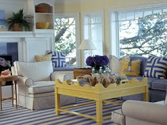
another coastal inspiration

this rug from Aspen Carpet Designs is very close to the one in the movie!


BVI's Virgin Gorda - beautiful!

great garden bench


3 comments:
Yay! I just found your blog!! I have the interior decorating skills of a yak, so maybe I will stalk you here and learn a thing or two!! I LOVE THIS ROOM! Someday, when all three of my girls have their own rooms, we'll be able to do something fun like this. I LOVE IT!
Beautiful room and isn't it nice to end up with a finished design that is loved by the client; in this case your daughter. I really liked what you said about designing for the specific taste of your client.
Post a Comment