As many of you know, for Christmas my daughter Emily wanted to give her room a makeover. This all started when she graduated from a twin bed to a double bed which happened within a few days of a visit to the new Ikea store in Charlotte, NC sometime this past summer.
Emily is 15 and is a big fan of Pottery Barn Teen. She had seen black, white and purple bedding in a catalog that came in the mail and fell in love with it. She loves purple. She loves black and white graphic images and she loves the "teen" look of this bedding. I, however, had a different idea in mind. As with any interior design job you have to meet the client's needs and I had two "clients". The first was Emily with her style and desire for a very cool room. The second client was my husband, Scott, the one paying for this makeover. He, of course, wanted to keep me on a tight leash knowing my tendancy to want high end items. This makeover was a challenge in more ways than one!
Scott and I had agreed that we didn't want to replace the flooring upstairs with more carpet. He and I both prefer fiber free options. We decided on laminate. It is a scratch resistant surface that should hold up beautifully to teens and pets. The room needed a new paint job. We asked Emily to pick a purple that she would like to use. We then chose a lighter shade of that color for the walls knowing we could bring the darker shade in with accents.
Emily had seen a desk at Ikea that was black glass with a clear floral pattern stenciled in. We used that desk as the inspiriation piece for the rest of the room. While I was at Ikea, I saw a black and white fabric that looked like it was designed by the same person that created the pattern on the desk. This became the canopy and bedskirt.
I had seen wooden wall cut-outs in an online design project and I knew that I wanted to incorporate that into the room. I drew branches loosely based on the pattern in the fabric and my dad cut them out with his jigsaw. God bless him. We then painted them the dark purple Emily had chosen. We added rope light to the branches so that they would cast a soft, moody glow on the walls. What is not shown in the pictures is a canvas of the Eifel Tower that hangs on a dark purple cut-out that highlights the art. My mom, bless her heart, sewed the bedskirt, canopy and all the pillows on the bed.
Emily didn't want any of her old furniture in her new room. As a matter of fact, she didn't want anything but a desk and a bed because she wanted her room to feel spacious. I knew she would need a night stand, so we repurposed a cube that had served elsewhere in the house for storage. We added a base and the small size, 22 inches, makes the perfect compact night stand, just enough for a new lucite lamp, a book and a place to put a glass of water at night.
Some art by a local artist and a bookshelf above the desk to house Emily's favorite books finish out the desk area. The windows were treated with a stripe on stripe sheer in white that softens the window and breaks up the light purple wall.
My two "clients" loved the result. My daughter is thrilled and already has invited friends over to "sleepover" in her new room. My husband was happy because I achieved what Emily wanted at a price he had specified.
A friend of my commented that the room was very clutter free and that Emily would likely add her own touches. It was as if she read my mind! I purposefully did not add picutres, desk accessories and decorative items because I knew that Emily would want to put her own mark on the room and that is just what I want her to do, only then will it be perfect!

A practicing interior designer shares her philosophy of design, what inspires, tips and tricks, and bits and snippets of her personal journey through the world of interior design.
Tuesday, December 29, 2009
Thursday, December 17, 2009
Pretty boxes for favors...


Monday, December 7, 2009
Christmas Make Over of My Teen's Room


For mothers out there that are considering re-doing your teen's room, here are some things to keep in mind. Purchase items that will work for dorm rooms or first apartments and on those items, invest in good quality. Determine one major impact element. An amazing headboard, a mural, graphic elements, or a large piece of art can add the punch that teens look for in a room. Use their favorite color in accents if it is especially strong or bright. Chose bedding that is washable and not so expensive that you mind changing it out when they grow tired of it. Duvet covers are a practical choice. Consider re-purposing furntiure you already own. A coat of paint and new pulls can transform a chest of drawers from infant to adult. Finally, lighting is a big issue for most teen rooms. Again this is a place to play and invest. I am using a very long term stradegy for a lamp on the night stand, investing in a quality piece that she can take into her first apartment. For fun, I found a paper floor lantern at Ikea that was inexpensive and adds a funky element to the room. This one, I will be happy if it lasts until college!
So have fun with your teen room make-over and stay tuned for pictures from mine!
Thursday, December 3, 2009
Seasonal Decorating in Adult and Kid Zones


Personally, I designate zones in my Christmas decore. The kitchen and family room are the kid friendly areas. The living room, foyer and dining room - in my case, office - are designed for the adult aesthetic. Take a look at the pictures here for beautiful ideas for you to implement in your own zones. Happy Decorating!
Monday, November 30, 2009
Monday, November 23, 2009
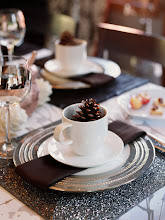
The Holiday Table...
Tis the season to set the holiday table and it's always inspiring to learn what other folks are doing. My Mother-in- Love, Dorothy Maxwell, always sets the most beautiful table during any event, but, especially during the holidays. Her attention to detail is exquisite. Dot always uses placemats that underscore the season with color, uses her good china, chrystal and silver without fail and adds lots of personal touches that make it intimate and charming. You will always find napkins adorned with a napkin ring or a bookmark that she has made and personalized for each guest. There are always delightfully unique placecard holders and each person always receives a special favor. Favors have included a hand painted china ornament, a little favor box of candies, a little booklet she has found and thought was special, the list is endless. Her centerpieces include flowers, candles, and decorative items that celebrate the season. Over the years, I have never seen a tablescape duplicated! She is a marvel. I wish that I had pictures of her tables to share with you. Since I do not, I will share a few tables that I think she would find pretty. Enjoy!
Wednesday, November 18, 2009
Using the things we love...
If we are honest, there are things in our homes that might not fit everyone’s idea of the ultimate in interior design. In Alexandra Stoddard’s book Creating a Beautiful Home, she talks about surrounding yourself with the things you love to truly create a home. She gives us “permission” to break the “rules” and include personally revealing items. Here are a few examples of the challenges we face when we do just that.
Recently, a Charlotte, NC client had a dilemma that we had to solve. Her husband collects autographed sports memorabilia and lots of it. The question that we faced was how to create a gallery style installation on the wall of her husband’s home office. The question wasn’t how to create a beautiful display, the question was how to select from such an abundance of beloved options. I recently found a photographer that photographs and compiles hard bound books for homeowners. I am going to share this with this client as a way to document this amazing collection.
My daughter recently asked me why we have a baby carriage in our foyer! The reason, I explained, is that it is from the 1800’s and has carried 5 generations of Maxwell babies. It is a lovely old piece with iron wheels and a rattan carriage. It fits perfectly in my foyer and there is no other option in my home. Is it appropriate to have an item like this in the foyer? Maybe not, but we love it and enjoy it every day.
Another client’s husband brings home treasures from his travels around the world. He is very sentimental about these items and wants them displayed. We chose two display cabinets in which to show these pieces and make them work. Do we love all the items? No. Do they make an impact as a collection in a showcase? Absolutley. Is the client enjoying the fruit of his travel? You bet, and isn’t that the point?
Keep the following in mind for the key to displaying one or more special items:
Focus - Create a prominent spot for one of a kind items. Spotlighting, framing or otherwising highlighting these items gives them importance and impact.
Balance—objects placed in relation to one another in order to create visual stability using symmetry or asymmetry. A rule of thumb; if you think that the physical weight of each side would balance on an actual scale, you have likely acheived the balance you neeed.
Proportion—objects grouped according to size and distribution of forms.
Visual focus/hierarchy—objects arranged in order to create focal points which attract the eye, utilizing shapes, sizes and colours.
Repetition—objects repeated in a grouping to create visual interest and unity by considering spatial relationships, colours, shapes or textures. Grouping like items creates impact.
Contrast & dynamics—objects placed in opposition or tension in order to create visual interest, involving elements such as colour (contrasting colours like red/green, blue/orange, yellow/purple), lightness and darkness, size or visual suggestion of movement (rhythmic, arrhythmic, random or directional).
I have always admired Alexandra Stoddard’s philosophy that your home should reflect you and the things you love, not a trend or what anyone else says. It is only by using personal items that we create the unique environment that we call home. So find a way to use those items that you are not sure you should. Display them with purpose and you will enjoy your home all the more for it!
Thursday, November 12, 2009
The Government Has Mandated Residential Sprinkler Systems - We Have to Get the State to Say NO!
On Tuesday evening my husband, Scott, and I attended the Rock Hill, SC, Home Builders Association meeting. Much of the evening was spent discussing the impact of the International Residential Code that was just passed in Washington. Unless state legislation is passed to opt out, every new house built in each state, after July 2011, will be mandated to have a fire sprinkler. Currently statistics show that the chances of surviving a home fire where working fire alarms are present is 99.45%. Smoke detectors save lives. The addition of sprinklers in the home is unnecessary and detrimental in two ways. First, it will add to the cost of ANY home, large or small. Secondly, most municipalities are not set up to handle the kind of water flow it would take to operate residential sprinkler systems. That means that if this regulation is passed by the states, individual water tanks would have to be buried in each yard to provide the water needed to run the system. The cost of this could run anywhere from $7 to $10 per square foot. In a 1,000 square foot starter home, the total cost of installing a sprinkler system and required water infrastructure would be $7,000+. Research shows that for every $1,000 increase in the cost of a house, 200,000+ young first time SC home buyers will be forced to give up the dream of owning a home.
Mandatory fire sprinklers will keep low income citizens at risk. In raising the cost of a house, the government is forcing the economically disadvantaged to stay in older, marginal housing, with little fire protection instead of moving into a safer modern home. Statistics show that most home fires are in older or mobile homes without hard-wired fire alarms. Mandatory sprinkler systems are no answer in this case.
My blog posts are normally about interior design and how to make your home beautiful. This subject, however, affects all of us and our children. I felt the need to post this so that we can all realize what is at stake and do something about it. Please call, write or email your state reps and let them know that mandatory sprinkler systems for private residence are just another government invasion of our homes and that this regulation MUST be thrown out! Thanks.
Wednesday, November 11, 2009
Prinicples of Staging for the Homeowner that is NOT Selling
I am often asked to stage homes in the Charlotte NC metro area and I have been thinking about the differences between staging and design. I have decided that we all need to apply staging principles from time to time to keep our homes fresh. When I stage homes, I go in with a completely different approach to the home than I do when I am going in on a design consultation. In designing a home, it’s often about what we want to add to a space. In staging it’s all about ommiting, or taking away from the design. When a home is for sale, buyers are looking at whether or not the home feels spacious and if they can imagine themselves living there. My job is two fold. First, to make the home look as large as possible. This is accomplished through the editing process. Second, to remove enough of the homeowner’s personality that the buyer can envision themselves in the space. As homeowners not selling our homes, it is good to walk through occassionally, and look at our space through the eyes of a buyer. We will see things that we might not realize until we notice them on purpose.
When I am trying to show off a home’s floor plan, several things are taken into consideration. Often, we re-arrange the seating area to create better traffic flow and show off the space. How we live, positioning the chair to watch t.v. or pushing the couch up against the wall so the floor is open for the kids to play, doesn’t always work in selling the home. I often have to prepare clients for a few months of discomfort in order for them to get top dollar for their house. Once the furniture is placed properly, we get stuff up off the floor. Baskets, magazine holders, stereo speakers, and the like, fill up the visual square footage. The more floor you can see, the larger the space appears. We even replace solid coffee tables for glass ones from time to time, so that the visual impact is lessened. In staging a home, removing clutter is paramount to success! Often, when we live in a space, we get used to the pile of junk on the corner of the kitchen counter or the stack of magazines on the floor by the reading chair. From time to time, check you floor space and make sure that your home isn’t getting too crowded. The same holds true for kitchen counters, crowded bookcases and home office areas.
When it comes to de-personalizing a home, we take away some, not all, personal photo’s and things of a more personal nature. I have toned down collections of all kinds from NASCAR to Pez dispensers, religious icons to heavy metal posters! This principle can apply to our own homes. Are our collections tastefully displayed, with impact, but not over the top? Are we sporting so many photo’s of the kids that folks don’t know where to look first? It is smart to edit your personal items every now and again because we become comfortable with things until we don’t realize our home is under a blanket of our “stuff”!
Very few folks live in a “model” home. I, for one, would love to, but, sadly with three kids and four critters, it’s just not happening. However, from time to time, I walk through the house to really look for what could be edited. Try it, you’ll be surprised at what you see and the changes that it will cause you to make. You might not want to sell your home, but sometimes the extra breathing room we create by editing our belongings, makes all the difference.
Tuesday, October 27, 2009
About Paint
Recently a Charlotte, NC interior design client wanted to repaint a home they had just purchased. The homeowner is a do it yourself guru and insisted on doing his own paint job. When I suggested Benjamin Moore paint for the job, this couple was agreeable until they saw the price tag on the Aura brand paint that I had specified for the job. The homeowner just didn’t believe that paying that much for paint could possibly be worth it. I encouraged him to buy one quart to use on the tray ceiling drop. You can compare high quality paint to a high thread count sheet. A cotton/poly blend gets the job done and if you don’t know better, you won’t know what you are missing. If, however, you have ever slept on 1000 count Egyptian cotton sheets, you know the difference is totally worth it! I told him that if he wasn’t convinced that the paint wasn’t significantly better than what he was used to using, I would not say a word! Needless to say, he couldn’t believe how much easier the whole process was with the Benjamin Moore Aura paint. “It went on easier, like butter, and covered in one coat!” said the homeowner. He went on to paint the rest of his home in the Aura paint. Fortunately for me, he liked the paint because, what I didn’t tell him is, that other brands of paint can rarely match the Benjamin Moore colors to their fullest depth. .
Clients often call me for color consultation when it comes to choosing paint. The process of choosing involves lots of considerations. How much light is in the room, what the homeowners want in terms of warm or cool, is there a focal wall, what other colors are at play… all of these and more help narrow the field of color choices. Once we have two or three choices, I encourage clients to buy a sample pot or color sheet so that they can see it in the room in a significant amount. I advise them to observe the color in different light at different times of the day. The way that color and light interact can make a difference in the color choice. Once a selection has been made, I encourage the painter, whether a professional or do it yourselfer, to color test the paint against the sample after it has been mixed. Once, a Benjamin Moore dealer had a problem with the calibration of their color mix and the colors that we chose came out significantly off from the samples. Fortunately, we did poster sized color boards, for one last review with the client, when we noticed the flaw. Had we not tested, the color would have gone on the walls with disastrous results!
I often tell clients that painting is the least expensive way to completely change the look of a room. If you get some color advice, choose high quality paint, look at the colors in different lights, and test the final paint mix before you begin painting, you can expect a beautiful result.
Tuesday, October 20, 2009
To Market, To Market...
We are just back from the High Point Furniture Market in High Point, NC. This year marks the 100th anniversary of this monumental trade show. It was, as usual, spectacular! It is hard to describe to those that have never been and I always feel compelled to try. Imagine an entire downtown area, sky scrapers ( well really short ones but none the less), cubby holes, strip shopping centers and office buildings filled to the brim with the brightest and best that every vendor can offer. Ten million square feet of show with give aways, food, festivities, and transportation at your beck and call. The way the city handles the thousands upon thousands of visitors is truly remarkable!
Every season, I report on the trends that I saw at the market. This year, I actually attended a seminar that reviewed 100 years of design trends and then a 15 minute wrap up on trends that are coming. I found the presentation to be fascinating and the speaker to be right on the money with his predictions.
Every season, there are multiple trends to track and this year was no different. The two most predominate that I noticed is the story of sober versus saturated. By that, I include color, pattern, and the overall style.
On the one hand is sober. It is a trend that sort of reflects the current economy, if you will. This trend is all about a sober and serious aesthetic. Think colors called "French Rain" and "London Fog" in the gray tones. For texture; wools, slubby linen, raw silk and other natural textures. Finishes include a "french market finish" which is a light wood with sort of a greyed out whitewash that showed up at Habersham as well as smaller vendors. This look is carried off with low voltage lighting and moody wall colors and accents. This quiet and somber trend is in direct juxtaposition to the other trend that I am calling saturated.
As with current runway fashion, the home furnishing industry is inspired by the 60's and 70's and they are bringing back colors and pattern from that era in a big way. Think Kelly green and marine blue, black, white and yellow, or, pink and orange in combinations. A pop art pattern, over sized and exaggerated, finish out the look. Even some of the most traditional vendors show cased this look.
Of course there are always "sub" trends. Metallics and embellishments are still a huge presence. Think nail heads and shells, sequins, buttons and other "bling". There is still a large segment of the market dedicated to what I have come to think of as a 'green' aesthetic. Reclaimed wood and recycled materials mark this style. Natural materials, vegetable dyed or tea stained colors are shown with natural elements. For example,the use of wooden stumps turned into stools or burlap turned into drapery panels. This pared down look works when the textures are really layered into the room. This trend is kind of colorless but really soothing and appealing in its own right.
As always, there is color trends to watch. At this market besides the grey and the saturated colors of the 70's, teal was seen across the board. Teal, a purple that leans toward pink (like a wine stain on a white napkin) orange and lime green were all fighting for dominance at the show. I had a client that wanted to find some coral accents and we did not find one!
That is the wrap up on the major trends that we saw at market. In later posts, I will share some of my favorite finds!
Sunday, October 11, 2009
Artwork for your walls...
As a former art major in college, I am completely opinionated when it comes to the subject of art in the home. I have a real hard time purchasing artwork with the sole purpose of “matching” the room. Art should be personal and meaningful to the client. If you are not emotionally involved with a piece of art, it has no place on your walls! I don’t care where you find it or if it is considered “serious” art, it has to speak to you on some personal level.
When clients are doing a space, we look to see if what they already own will work. If something new is needed, I encourage them to think “locally” and support the artists in the community whose work interests them. There are art galleries, art and craft fairs, art leagues that have shows and events, and, even restaurants that showcase art work. It makes local work easy to find.
Today there are many options for wall décor. We have used mirrors, game boards, photographs, old signs, iron pieces, wall vases, shadowboxes, baskets, tapestries, textiles, architectural salvage, sports equipment, pressed tin, dried botanicals, children’s artwork, plates, platters, maps, and matchbooks. We have framed keys, doorknobs, letters, baby clothes, ballet shoes, spoons, antique certificates, pages from books, pages from calendars, mementos from trips, playbills from theaters, sports memorabilia, movie theater posters, and nautical items. There are so many options that the sky is the limit. I have even coached clients in creating their own art piece and have hung several pieces of art created by the client’s children. I encourage you to leave the commercial retail print off your shopping list when there are so many other options for the walls in your home. Have fun with your choices, be bold, shop original, create your own and the walls of your home will have a personality as unique as your own!
Tuesday, September 8, 2009
Ahhhh Autumn
Crisp cool days, brilliant fall colors, football season, these are just the many signs that summer is waning and Autumn is upon us. I, for one, look forward to this season with a sense of relief as we get a break from the heat and humidity. In the coming weeks, we will want to cozy up our interior spaces. Layering the home, like we see in the world of fashion, accomplishes this task. Adding a couple of throws, one to your sofa and one to a favorite reading chair is a good place to start. Adding some extra lighting also helps as the days grow shorter. Candles, accessories, artwork and fall arrangements can all add to this "warming" up of our homes.
Autumn is great time to change things up even more than just added items. I often encourage clients to add drapery panels to their blinds, woven wood treatments or shutters in the fall and winter months. Try re-arranging your furniture to create a cozier conversation area. Bring your furniture off the wall and group them in the center of the room around the fireplace. Try changing your artwork and accessories by exchanging their places in your home. For instance, try using the artwork and accessories that you have in the dining room in the family room. Trade items in the master bedroom for ones in the living room. By playing with what you already own, you can create a whole new look. If you have trouble doing that, the services of a designer may just be what the doctor ordered. Many of us in the design industry offer room re-do's or a re-decorate in a day services. It's a small expense with a big impact for your home. Whether you make big changes or small, Autumn creates a sense in all of us that the time to cocoon is upon us.
Autumn is great time to change things up even more than just added items. I often encourage clients to add drapery panels to their blinds, woven wood treatments or shutters in the fall and winter months. Try re-arranging your furniture to create a cozier conversation area. Bring your furniture off the wall and group them in the center of the room around the fireplace. Try changing your artwork and accessories by exchanging their places in your home. For instance, try using the artwork and accessories that you have in the dining room in the family room. Trade items in the master bedroom for ones in the living room. By playing with what you already own, you can create a whole new look. If you have trouble doing that, the services of a designer may just be what the doctor ordered. Many of us in the design industry offer room re-do's or a re-decorate in a day services. It's a small expense with a big impact for your home. Whether you make big changes or small, Autumn creates a sense in all of us that the time to cocoon is upon us.
Wednesday, August 19, 2009
The Association of Interior Design Professionals
There is a new organization in town that is ready to take ASID and IDS by storm and it is the Association of Interior Design Professionals. The AIDP was created as to answer designers concerns about the proper use of today's online marketing and social networking. The group plans to be on the cutting edge of technology, while promoting the goals of the group. These goals are to promote, partner with, and help prosper the members of the organization while providing prospective clients with design partners of the utmost integrity and a way to find them on the world wide web.
As of now, I am serving as the new vice-president of the local chapter. We had our first board meeting last week and I was amazed at the synergy and excitement that flowed out of the members in attendance. This is really the start of something BIG!
As of now, I am serving as the new vice-president of the local chapter. We had our first board meeting last week and I was amazed at the synergy and excitement that flowed out of the members in attendance. This is really the start of something BIG!
Sunday, August 2, 2009
Mixing Accessories
My Mom has finally moved to the area and in doing so, we have had to place her things in the new house. Finding the right balance of accessories for this new space has been a challenge. Her old home was traditional in the layout with lots of walls on which to hang artwork and accessories. The new house has an open floor plan that has fewer walls but one or two that are gigantic in size. The challenge has been to take the older, more traditional items and make them work in the new space. Ever had that happen to you? What came to mind as we worked to dress the walls were the tried and true design principles that apply to these situations. First, remember to balance your purchases in size and scale. My mom has a ton of wonderful artwork; however, most of it is smaller in scale. She needs to purchase one or two oversized pieces to balance all of the smaller items. The same goes for tablescapes. You don’t want everything on your end tables, chests, or bookcases to be similar in size. Pair an oversized box with a small frame and a medium size candle. Choose one large decorative accessory and showcase it on its own shelf. Leaving some book shelves minimally adorned will help the eye rest from all of the visual stimulation of book covers.
For wall groupings, remember to hang like things together for impact. To further the impact, frame the items all alike. For instance, my Mom is working on a family wall grouping. She has chosen candid black and white photos of all of her grandchildren. She is going to change those photos that are in color to black and white. All of the frames are similar in finish. She has chosen different sizes for interest, but the unity of the photos and frames will make for a beautiful wall arrangement. Just so you know, we are still working on the enormous dining room wall. Together we are looking for just the right mix to keep the wall from dwarfing the room. You know what that means... SHOPPING!
For wall groupings, remember to hang like things together for impact. To further the impact, frame the items all alike. For instance, my Mom is working on a family wall grouping. She has chosen candid black and white photos of all of her grandchildren. She is going to change those photos that are in color to black and white. All of the frames are similar in finish. She has chosen different sizes for interest, but the unity of the photos and frames will make for a beautiful wall arrangement. Just so you know, we are still working on the enormous dining room wall. Together we are looking for just the right mix to keep the wall from dwarfing the room. You know what that means... SHOPPING!
Monday, May 4, 2009
A review of the High Point Spring Market
There were several trends at the High Point Market last week. The most prevelant being a very organic and natural look. Think burlap, slubby linen, cotton, and raw silk. Picture reclaimed wood, accessories and lamps that incorporate branches with the bark still on, and hand waxed finishes. The color story with this trend is soft vegetable dyed colors. Color names like moss, milk paint, dove grey, wool skien, and butter cream tell the story. This style is all about texture, clean lines, and a celebration of all things "green" as in recycled and earth friendly.
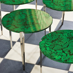
The second trend that was everywhere was the color Malachite! Paired with black and white for a modern take or layered with navy and sun yellow for a retro vibe, this color was hot in accessories and upholstery.
Embellished textiles create a luxe look.
Humor with a touch of kitsch was scattered throughout the market as if to indicate that in our homes we are going to keep humor and optimism alive despite economic times!
In all, there were lots of juxtapositions in the market and something for everyone. I loved the natural look for it's very earthy and serene feeling. I always enjoy color and was taken back to my mom's bedroom in the 70's with the malachite paired with black and white. Intricate handwork on textiles is fascinating and leaves me amazed at the hours that it must take to create such art. Finally, I am glad that we have not lost our collective sense of humor in such economic times!
Monday, January 5, 2009
Lighting it up!
Lighting can make or break a room, believe it or not. Your furniture could be perfectly placed, the pieces carefully chosen for the room, with accessories that are spot on, but, if the lighting is not right the room will fall flat. There are three layers of lighting important to any room.
The first layer is ambient lighting or overall lighting. This type of lighting includes chandeliers, can lights, and other ceiling fixtures. Any fixture that spreads light generally over a room is included in this category.
The next layer is accent lighting. These fixtures highlight different focal points in a room. You might use accent lighting over a fireplace to highlight artwork, or over a bookcase or china hutch. Wall sconces fall into this group as well.
The final layer of lighting in a room is task lighting. These are usually lamps that will aid you in reading a book or working at a desk. Each room should have a minimum of three lamps. One for each end of a sofa and another for an occasional chair or loveseat. Too many times, homeowners will depend on one overhead light to perform the task of both ambient and task lighting. In order to get enough light to perform tasks this way, the homeowner often uses bright bulbs that end up casting a harsh glare on the room. Well designed lamps are found at every price point. You can find good looking lamps at Wal Mart. Price should never be the cause of not providing task lighting. The biggest secret to purchasing lamps is to purchase the right size. A lamp should be tall enough on your side table to cast light down over you when you are seated. I often tell folks to purchase lamps between 28 and 32 inches. The size of the table that the lamp is on will determine the size of the base of the lamp. If you have a large side table, the base of your lamp can be nice and chunky. If your side table is tiny, the lamp base need to be skinny. If you have a short lamp but like the style for the room, place it on a stack of books to raise it to the correct height. Often lamps look dated because of the shade. The Lamp Place on South Boulevard in Charlotte is great for helping you find the right shade for your lamp. They will often change the harp and the style of the shade to provide a brand new look for a lot less than the price of a new lamp. In addition to table lamps and swing arm lamps, clients often ask where to use floor lamps. Floor lamps are great beside a chair that doesn’t have a companion table. Floor lamps also work when the side table is an unusual size or shape.
Lighting is to a room as accessories are to the completion of an outfit. Bottom line, don’t skimp on lighting!
Subscribe to:
Posts (Atom)
Calgon Take Me Away...

soak your troubles away in this stone beauty

Bathtub becomes fountain... fabulous!

cottage charm!

perfect for your mountain retreat!

Where I belong...
The AIDP Charlotte Chapter Board Members

Seated from left, Davetta Moore, National Board Member, Wanda Horton, Vice President of Communication, Jane Ann Maxwell, President, standing from left to right, Nancy Martin, Vice President of Membership, Mary Santini, Secretary/Treasurer, and Marianne Parker, National Board Member
Emily's New Room


This desk was the inspiration for the room
Decorating for Christmas in Adult and Kid Zones...
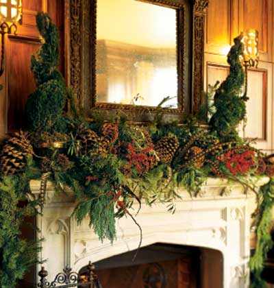
Adults will love the beauty of the luxe mantle

This bright, bold mantle is kid friendly

This lovely arrangement is sophisicated and elegant

Kids tables need centerpieces too and these serve as favors to take home afterwards!
The Holiday Table...
This table setting would make a beautiful Thanksgiving breakfast table

Greenery - simple and elegant
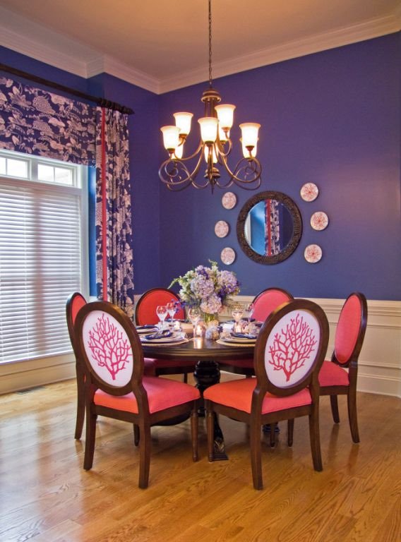
These pictures illustrate the idea of using what you love...
One home owner loves classic traditional decore, the other mid century modern. Look at what they created using the things they both loved!!!

Grouping beloved collections create impact

Two collections united by color
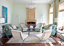
Pictures from the Coastal Vibe Project
The chair fabric was designed just for this client and then made into yardage just for these chairs!

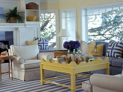
The living room seating area. The client wanted it elegant and yet relaxed, with the idea of being at a house on the beach.

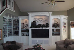
We added the built-ins and had the paint changed before the homeowner moved in. A cozy seating arrangement and momentos from world travels warm the space.

another view
These pictures illustrate "staging" principles

This beautiful room was designed to be cozy and full. This room is an example of NOT staging to maximize the square footage. Thanks to House Beautiful for the image

This serene room is designed for maximum spaciousness! Notice that you see lots of floor through the legs of the coffee table. Lots of breathing room in this space. Thanks to House Beautiful for the image.
This is an example of Benjamin Moore Aura paints to go with the About Paint post

One of the many beautiful colors in the Aura collection

Aura paints have low VOC's which means it's healthier for everybody!
Local Artists...

Richard Anderson

Celia Flock

Sany Seipert, an older work, her newer stuff is better, this was the only image I had...
Bella Luna was one of my favorite showrooms!
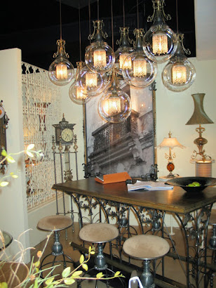
everything on display was quirky and elegant

One of my favorite finds, this mirror is a piece of art!

These sassy stools help tell the Bella Luna story

Cyan design always has unusual and neat things
Hot Color Trend shown at the Spring Market in Highpoint!
black and white and malachite!
Luxury Lighting!


Favorite New Accessoires...

Contact us for more information or to place an order...

love this!

simply elegant!

fabulous silver platters that are even better in person

These make such a great centerpiece for a dining room table
FALL MARKET 2008 - GORGEOUS COLOR, FOCUS ON "GREEN" DESIGN, FUN WITH LAQUER...
New color combo that was everywhere, butter and pewter, so pretty, soft and fresh!
Gorgeous Global Views - always my favorite venue
soft butter and pewter
"GREEN" in both color and sustainablity is a beautiful choice...

These pillows made from abaca leaves and coconut beads are eco-friendly and good for the workers of the developing country in which they are made.
Old favorites are still in play...

aqua, teal, peacock are still popular-- note the laquered mirror!
Before and After pictures are always fun!
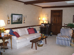
This is a "before" picture of a recent project.
After #2!

Before #2
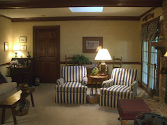
same room, different view
AFTER!
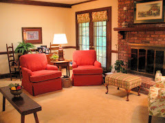
new carpet, upholstery, paint, window treatments...
More from the High Point Spring Market My Favorite Overall Venue - Global Views
terrific accessories, uniquely displayed

black, white, red, silver punch!

note the male figures at the bottom of the ropes climbing out of the vases!
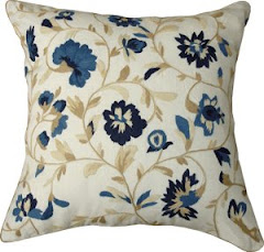
Favorite Find at the High Point Spring Market
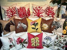
Pablo Mekis Artisan Pillows
the hand stiching is fabulous!

more Pablo Mekis
Introducing...

Marilyn Croteau - the BEST window treatment workroom on the East Coast
Introducing...
Heavin Woodworks - beautiful trims and built-ins
Introducing...

G.Richard Anderson Faux Finisher. He does fabulous work!
Oeco Textiles

all natural and all green
A staged breakfast room

We recovered the chairs to co-ordinate with the area rug and added a fresh bunch of flower from the grocery store!
Something's Gotta Give

from the movie "Something's Gotta Give" the set design for the Nantucket living room is inspiration for a coastal interior that I'm working on right now...
Coastal Inspiration
another coastal inspiration

this rug from Aspen Carpet Designs is very close to the one in the movie!


BVI's Virgin Gorda - beautiful!

great garden bench