Pantone's Fall Color Trends
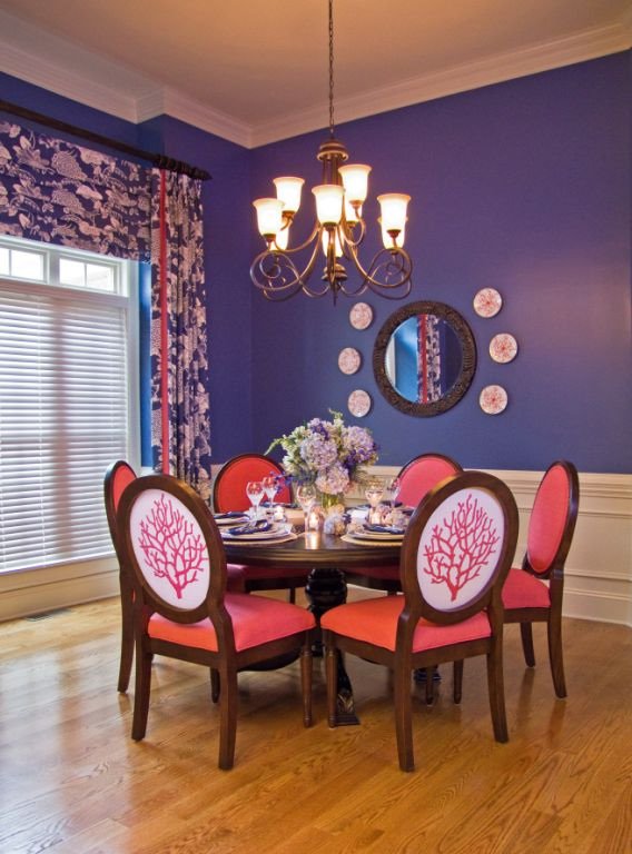
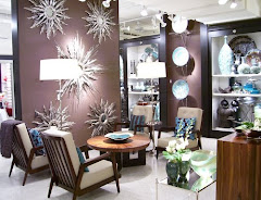
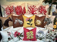
These color trends tell us a lot about what is going to be available to us as designers. These colors were actually selected several years ago by the industry folks that forecast what will work in the coming market. Manufacturers then take these projections and incorporate them into the goods that they produce. If you have ever looked for a color that wasn’t currently popular, you will know what I mean. Two years ago, I needed a deep coral color to accent a dining room. I, literally, had to make my own fabric because we could not find coral color anywhere! Now it is all over the place, as one of Pantone’s hot colors for fall.

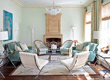
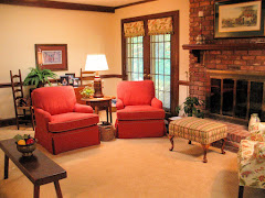
A lovely room in Oyster and Coral

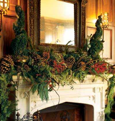
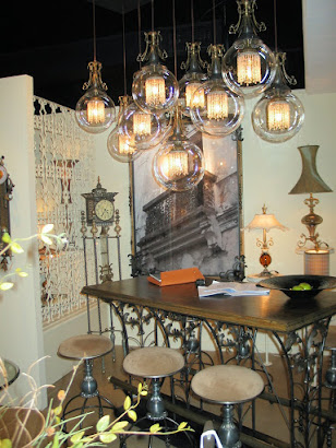
An example of Woodbine and Endive

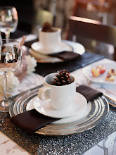
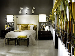
Martha Stewart does Lipstick Red
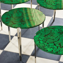
Lagoon is the newest variation on Pantone’s color of the year; Turquoise. This version has added a touch of grey and green to tone it down a little. It is still quite vibrant and works well with the other versions of turquoise that Pantone has offered in their spring, summer, and, no doubt, winter offering.

Lagoon mixed with Woodbine